Browse through a highlight of some of the key features of our software that allow you to calibrate, run, and view your results with ease and clarity while having confidence that the model reflects real life.
Drag-n-Drop
Simply drag the unit processes onto the drawing board to lay out your plant.
Connection Paths
Drag the connections between the unit processes to define the flows.
Customize
Change labels of processes and streams for simple identification.
Move the processes and connection paths to make the layout simple to follow.
The mathematical description of the influent wastewater that is fed to the plant model is the single most important aspect of a simulated system. Without significant consideration of the influent characterization, the plant model will be limited in its ability to predict the dynamic behavior of the plant and match actual process data.
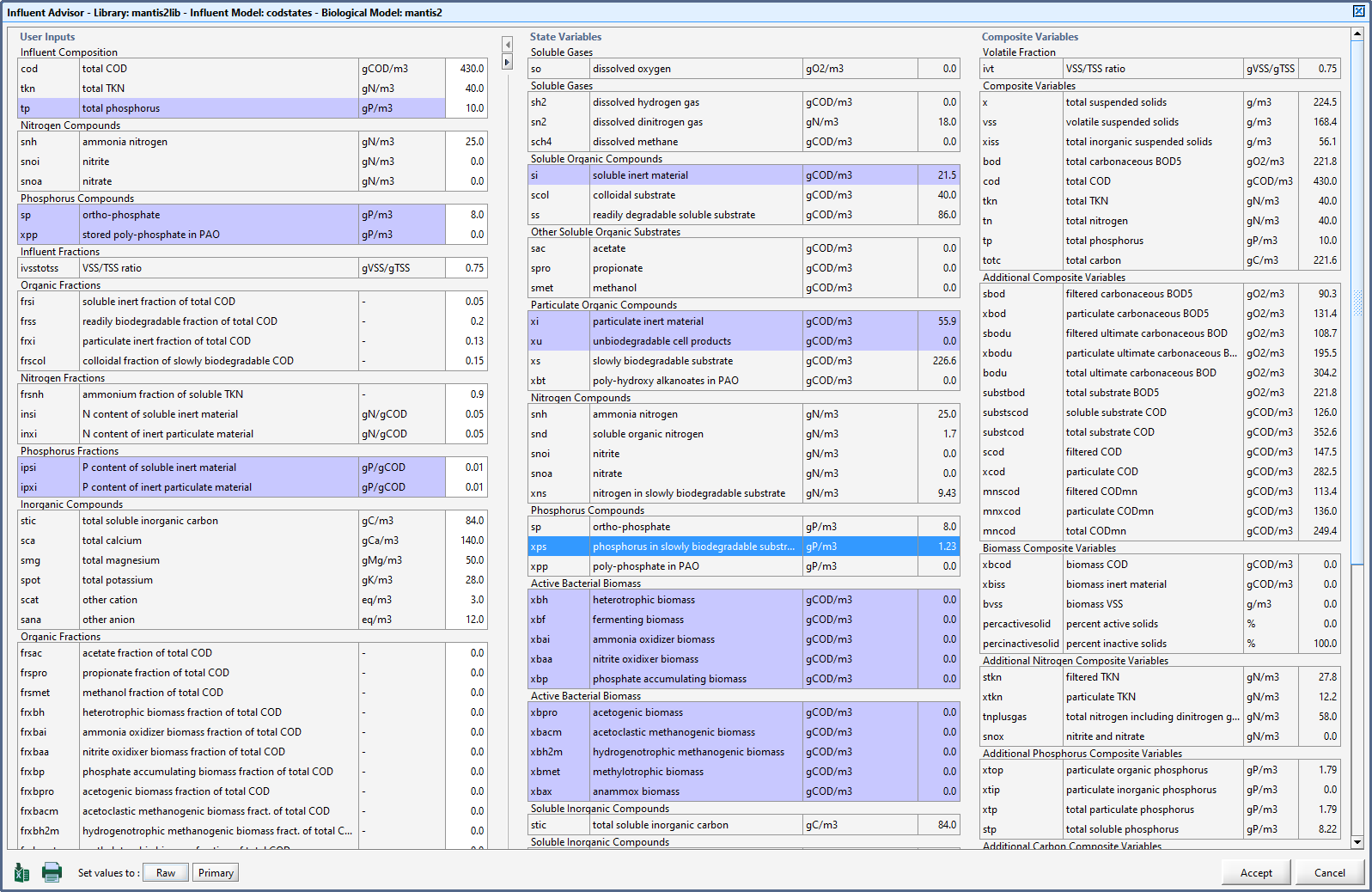
The GPS-XTM Influent Advisor makes it simple to navigate the influent models and achieve the influent characterization most consistent with the available measured data.
Simply click on the variable of interest and all of the variables that are involved in the calculation will be highlighted.
This built-in tool eliminates the step of cutting and pasting data from a spreadsheet to a model layout.

Slider Control: Adjust the independent variable's value by moving the indicator back and forth on the track or edit the value directly in the text field.

Increment Control: Use the two buttons to add or subtract a specified amount to the independent variable or edit the value directly in the text field.
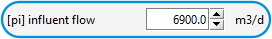
Discrete Control: An example is an on/off button allowing the activation/deactivation of the independent variable.


File Input Control: This type of controller will read in data from a file. It can handle both discrete and continuous data.

Analyze Control: This one automatically varies the value of the independent variable with your specified values for the minimum, maximum, and incremental values.

Optimize Control: This controller is used by the solver to automatically adjust the variable to determine the optimal value for the targeted result.


Organize
Instead of keeping track of multiple layout files, you can create a single base layout and use it to create multiple instances of data set modifications.

Compare
Compare the differences between scenarios.

View
View the variables that are changed in the scenario.
When organizing simulation runs it is useful to start with a base set of data, and then create one or more separate cases, which are modifications to the base data set.
These cases are referred to as scenarios in GPS-XTM. In each scenario you can specify the changes to the model parameter(s), which define the scenario and then save it so that it can be restored at some point in the future.
This functionality manages all the changes in one layout and thus eliminates the need to create and maintain multiple layout files.
You can also view and compare the differences between each scenario within GPS-XTM.

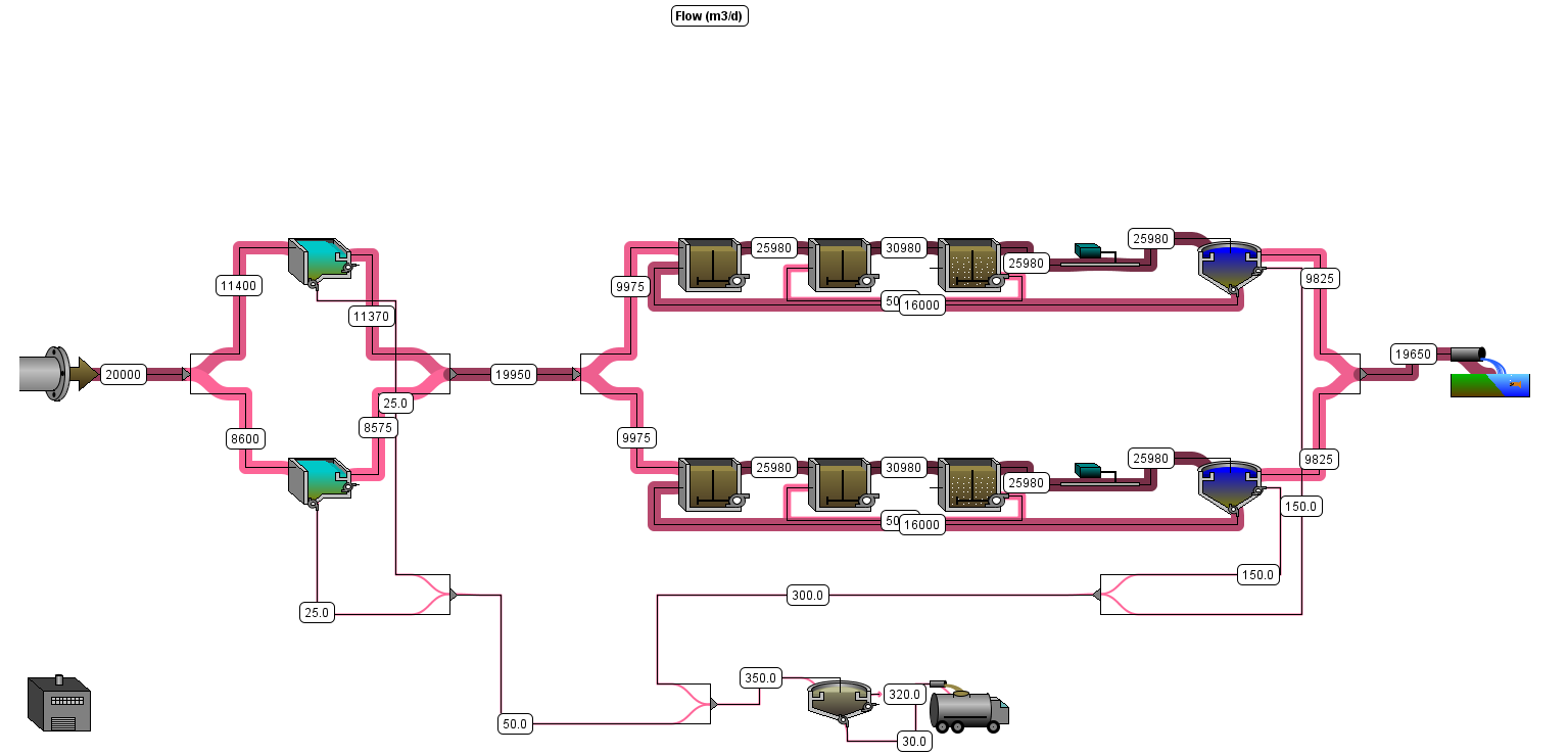
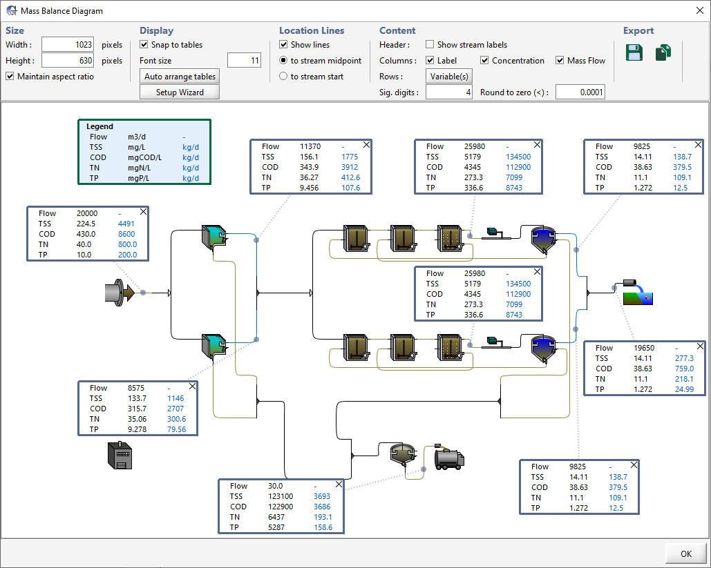
Sankey diagrams were originally developed by Irish engineer H. Riall Sankey. Sankey diagrams allow for the concise display of the flow of flux of any given quantity like energy, flow or mass in a system.
In these diagrams, the thickness of the line corresponds to the magnitude of the display quantity.
Sankey diagrams are particularly useful for wastewater treatment, as the plant layouts contain a series of inter-connected flows in series and/or parallel (with recycles). They put a visual emphasis on the movements of components through the system.
There is no more need to manually draw these diagrams by yourself or attempt to learn and use some other graphic software.
GPS-XTM can automatically generate a Sankey diagram for many different components like flow, solids, and nutrients that are tracked throughout the plant and the values of these variables are superimposed on the layout that you created in GPS-X.
If you need to update your model in the future, simply rerun your simulation, click the button to view the new Sankey diagram and export the image for use in your report or PowerPoint slide.
It's as simple as that!
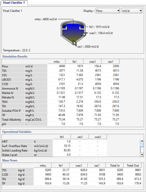
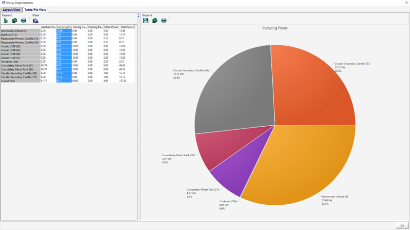
This view presents an image of the layout with 'hot spots' around the unit process representing the value of the variable selected. A larger value is indicated by a more intense color.
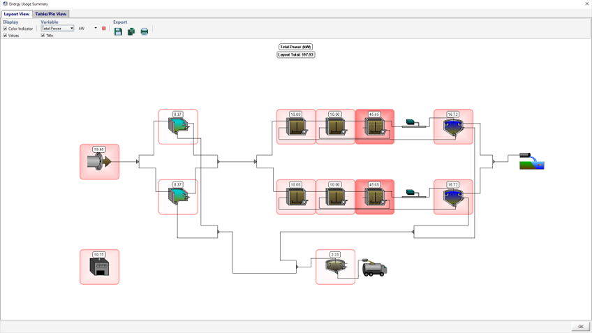
The window is separated into two sections:
In addition to our existing sankey diagrams and energy usage and operating cost summary diagrams, we've added another option for presenting data and creating informative visuals for your reports and/or PowerPoint slides.
There's no need to go through the hassle of exporting the layout image and then manually creating tables to superimpose on the diagram and copy/paste the values from the model into the table.
Now within GPS-X, you can quickly and easily add tables to the drawing board and drag them around to the perfect positions. Then select the content and format that you'd like from a list of common parameters.
Once you're happy with how it looks, export the image and include it in your report.
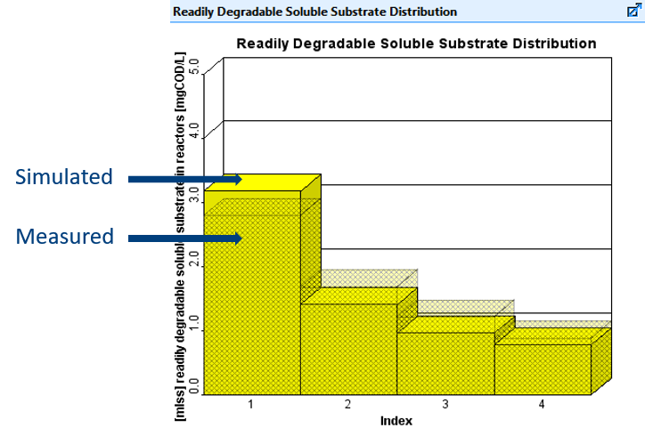
The built-in statistical analysis tool in GPS-XTM allows the user to statistically compare the measured and simulated datasets during model calibration and validation studies. The statistical analysis tool allows for qualitative assessment through visual representation as well as quantitative assessment through a set of statistical indices.
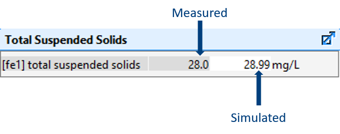
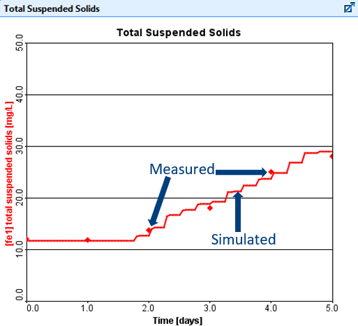
For example, Figure 1 displays the TSS effluent from the model (lines) and the actual data (points). Figure 2 presents a statistical plot of the predicted vs. measured data providing a qualitative determination of the goodness of fit. Upon visually inspecting this graph, the user can easily determine if there is a model bias present or any systematic errors. Figure 3 presents a histogram of the standardized residuals.
To avoid the user from having to export the GPS-XTM output data into an external excel file for statistical analysis, GPS-XTM offers a library of statistical indices that may be helpful in quantitative assessment in model validation and calibration studies. Figure 4 presents an example of the statistical output that is generated for a time series dataset.
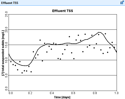
Figure 1. Model predicted and measured effluent TSS concentration vs. Time.
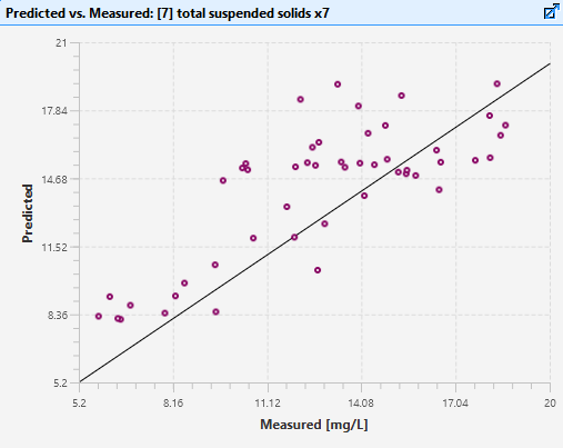
Figure 2. Model predicted vs. easured effluent TSS.
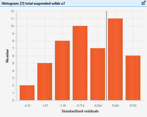
Figure 3. Histogram of standardized residuals.
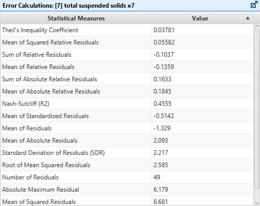
Figure 4. Output of statistical indices.
Excel spreadsheet reports can be generated directly from GPS-XTM, showing all simulation data and images in a well organized tabular format. A standard list of check boxes allows you to include/exclude various types of information to make the report more manageable.
Need a more specific report layout? Customized report templates can be designed for specific jobs.
For a more finalized/polished version of your report, you can export all information directly to Word.