CHAPTER 7
What is an Output Display?
Output refers to the graphical or textual information generated by GPS-X. This can exist as a display or as a data file. Displays can be static, or they can be linked to the simulator such that the display is continuously updated as the simulation progresses.
Output can also be saved to data files so that you can obtain prepared reports, store data in archives, etc. The sections below describe the types of output available and procedures for setting up and generating the output.
In Simulation Mode, the main window is divided up into three different regions: Controls, Outputs, and the Drawing Board (Figure 7‑1).
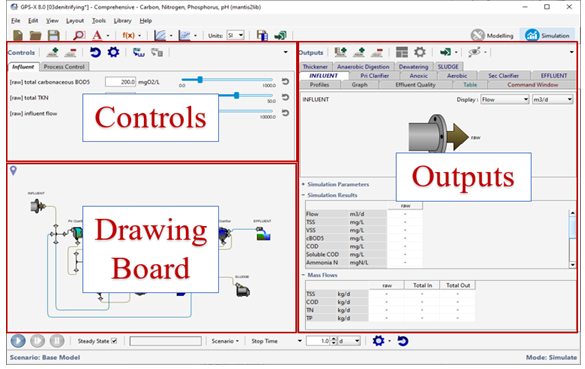
Figure 7‑1 – Three Regions of Simulation Mode (Controls, Outputs, Drawing Board)
Output displays are set up and used in the Simulation Mode. They are organized into tabs. You can create as many tabs as you like and organize them in whatever way is convenient.
Outputs Toolbar
At the top of the Outputs section of the main window is the Outputs toolbar. This gives you access to many features pertaining exclusively to the output displays.
![]()
Figure 7‑2 – Outputs Toolbar
|
|
New Table Tab –This will start a wizard to help you set up a table with your desired output variables. It will place the new table onto its own tab. See Table Displays for more information. |
|
|
New Graph Tab –This will create a new tab for User-Defined Displays. |
|
|
Delete Tab – This will delete the current tab and its contents. |
|
|
Auto Arrange – This will automatically size and arrange the user-defined output displays so that they are all visible on their tab and cover the available space. |
|
|
Output Properties… – See the Output Properties section below. |
|
|
Export – This displays a drop-down list of the options available to export data from GPS-X for use in a report or spreadsheet. |
|
|
Additional Output Displays – This displays a drop-down list of all available process schematic outputs. See Process Schematic Output Summary. |
|
|
Tab Listing – This displays a drop-down list of all of the output tabs so that you can easily select the desired one. This can be useful when you have many tabs. |
Type Summary
There are several different types of output displays. Each output tab will contain one type of output and the label on the tabs have a different appearance depending on the type of output that it contains.
Quick Display
These panels provide a quick summary of the most important information for each unit process object in the model. See the Quick Display section for more information.
Table Displays
The tables are user-defined summaries of model outputs across the entire length of the plant (which can also be displayed in graphical form). See the Table Displays section for more information.
Bar Charts from Table Display
A visual representation of a row in the Table Displays can be created. See the Bar Charts from Table Display section for more information.
User-Defined Displays
The tabs that contain user-defined output displays can contain one or more graphs constructed from any output variable in the model. See the User-Defined Displays section for more information.
The following eight types of output displays are available to plot any output variable from any unit process:
1. X-Y time series plot – with time on the X-axis and the dependent variable on the Y-axis.
2. X-Y Scrolling time series plot – with the same axis labels as an X-Y time series plot and scrolling to the right with each time increment.
3. Bar Chart (primarily for array variables) – with each vertical bar representing a single array element’s value.
4. Bar Chart (Horizontal) – similar to Bar Chart, but with the bars running horizontally, instead of vertically. Primarily for display of clarifier data.
5. Digital – displays only the current value of a variable.
6. 3-D Bar Chart – displaying 2-D arrays where the z-axis is the array element’s value.
7. Grayscale – where an element’s value is associated with a shade of gray.
8. Probabilistic (Monte Carlo) – histogram representing percent probability of each bin.
In Analyze Mode, GPS-X substitutes the specified independent variable for time on all the time series displays to create a special X-Y plot. Refer to the Creating User-Defined section below, and CHAPTER 9 for more information on this type of graphic.
State Point Analysis
The secondary clarifier objects (circular and rectangular) provide options to plot State Point Analysis Graphs.
Send Data Directly to File
This option sends the simulation data directly to a plain text file. You may wish to do this to store simulation data for processing externally to GPS-X. See the Saving Data to Text File section for more information.
Process Schematic Output Summary
In addition to the output displays that are set up in the Output section of the main window, there are four types of Process Schematic Outputs that are shown in their own display windows since they require more space to visualize. The four types are:
Sankey Diagram
Five commonly used variables (Flow, TSS, COD, TN, and TP) can be displayed on a Sankey diagram. Sankey diagrams are flow diagrams that display variable quantities in terms of arrow width. This allows users to look at the plant's performance visually. See the Sankey Diagram section for more information.
Energy Usage Summary
This feature generates an energy usage summary based on the operational conditions and costs specified by the user. The values are displayed as a varying intensity of color around the unit process on the drawing board.
Operating Cost Summary
This feature generates an operating cost summary based on the operational conditions and costs specified by the user. The values are displayed as a varying intensity of color around the unit process on the drawing board.
Mass Balance Diagram
Five commonly used variables (Flow, TSS, COD, TN, and TP) can be displayed on a Mass Balance diagram. Mass Balance diagrams are flow diagrams that display variable quantities in a tabular form. This allows users to look at the plant's performance numerically. See the Mass Balance Diagram section for more information.
Quick Display
The Quick Display panels available in Simulation Mode are designed to present the important information to the user in the easiest manner possible. When you first build a layout, a Quick Display panel for every process on the drawing board is automatically created for you as a good starting point for setting up your outputs.
You can remove any of the Quick Displays that you are not interested in by using the “Delete Tab” button on the Outputs Toolbar.
Double-clicking on any object in the drawing board will either create a Quick Display tab for that object (if it does not already exist) or select the existing Quick Display tab.
Figure 7‑3 – Example of Quick Display
Exporting Data from Quick Displays
|
|
The entire Quick Display can be exported to an Excel spreadsheet by clicking on the “Export Data to an Excel File” menu item found in the Export button drop down list on the Outputs Toolbar. This will open a file browser where you can choose the name and location of the file. |
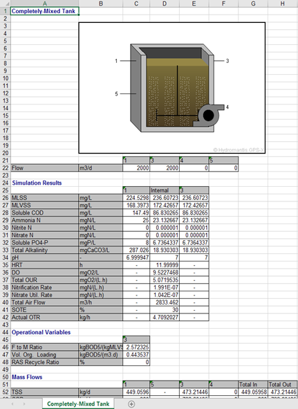
Figure 7‑4 – Quick Display Exported to Excel
|
|
Additionally, the entire Quick Display can be exported to a Word document by clicking on the “Export Tab to Word” menu item found in the Export button drop down list on the Outputs Toolbar. This will open a file browser where you can choose the name and location of the file. |
|
|
|
|
Alternatively, you can copy the data (text only) to the system clipboard by clicking the “Copy Data to Clipboard” menu item from the Export drop down list Outputs Toolbar. The data can then be pasted into a report or spreadsheet. |
||
If you only wish to export a specific selection of the data, simply highlight the rows in the Quick Display table and then right-click on it. A popup menu with the options of either copying the selection or the complete table is presented.
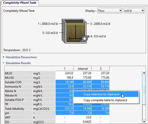
Figure 7‑5 – Quick Display Copy to Clipboard
Table Displays
Reporting simulation data in a Tabular format is very convenient for preparing outputs for selected stream and process variables. The stream variable tables are very useful for viewing the mass balance of the most important plant variables across the whole plant.
There are two types of Table Displays:
Stream Variables
These tables display variables that are associated with the streams such as flow rates, state variables, and composite variables. An option is provided to tabulate the concentration values and/or the mass flows for the streams.
Process Variables
These tables display variables that are associated with the process itself like volume, HRT, organic loading, energy consumption, etc.
Setup Wizard
|
|
To create a Table Display, click on the “New Table Tab” button on the Outputs Toolbar. This will start the Table Properties Setup wizard (Figure 7‑6). |
(1) The first option to select under Table Type is whether you would like this table to display stream variables or process variables (see above for distinction).
(2) If this is going to be a stream variable table, you must decide whether to include the concentration values and/or the mass flows.
(3) You then simply select the location of the variables (left pane) and the specific variables themselves (right pane).
(4) When you are satisfied with your selection, click ‘Accept’ to create the Table Display tab (Figure 7‑7).
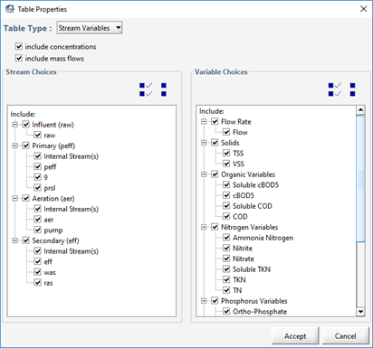
Figure 7‑6 – Table Display Setup Wizard
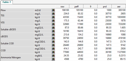
Figure 7‑7 – Example of a Table Display
Exporting Data from Table Displays
|
|
The entire Table Display can be exported to an Excel spreadsheet by clicking on the “Export Data to an Excel File” menu item from the Export drop down list on the Outputs Toolbar. This will open a file browser where you can choose the name and location of the file. |
|
|
Additionally, the entire Table Display can be exported to a Word document by clicking on the “Export Tab to Word” menu item found in the Export button drop down list on the Outputs Toolbar. This will open a file browser where you can choose the name and location of the file. |
|
|
Alternatively, you can copy the data (text only) to the system clipboard by clicking the “Copy Data to Clipboard” menu item from the Export drop down list Outputs Toolbar. The data can then be pasted into a report or spreadsheet. |
|
|
If you only wish to export a specific selection of the data, simply highlight the rows in the table and then right-click on it. A popup menu with the options of either copying the selection or the complete table is presented. |
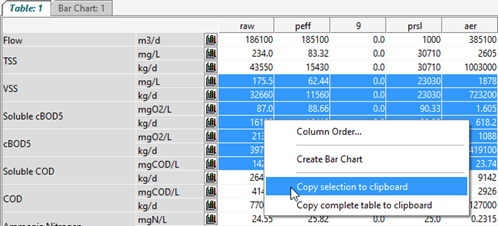
Figure 7‑8 – Table Display Copy to Clipboard
Settings
|
|
Clicking on the “Output Properties” button on the Outputs Toolbar, will bring up the Setup Wizard where the current selections can be changed. |
Column Order
Right-clicking on the Table Display will pop up a menu where one of the options is “Column Order…” (Figure 7‑8). This will display a dialog window where you can change the default order of the column in the table.
Bar Charts from Table Display
|
|
You will notice that each row in the Table Display will have a small “Graph” button (Figure 7‑7). This button creates a bar chart of that row’s data. A new tab will be created that shows all data in the selected row. (see Figure 7‑9) |
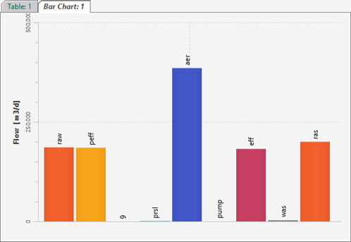
Figure 7‑9 – Bar Chart created from Table Display
Settings
|
|
Clicking on the “Output Properties” button on the Outputs Toolbar, will display a dialog window where you can change various settings for the Bar Chart |
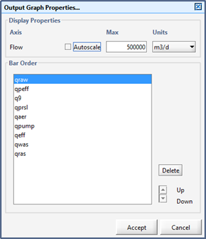
Figure 7‑10 – Bar Chart Properties
The options include settings for the y-axis (autoscale or setting the maximum value, and units), as well as the order of the bars. You can also remove a variable from the chart by selecting it from the list and clicking “Delete”.
User-Defined Displays
You can create any number of user-defined graphs on multiple tabs. This allows users to plot additional information in formats that are the most useful for the simulation task at hand.
These displays must be created before running a simulation. This means that in setting up a simulation, you should consider the types of graphics desired, the variables to be plotted, and their minimum and maximum values. Think about the model behavior you would like to observe and ways to group output variables to maximize the information content.
Here are some guidelines for presenting data in output displays:
· Group Variables to be compared within a Single Graph. For example, the state variable related to phosphorus removal in a single reactor can be compared easily if they are on the same display. Grouping encourages a visual comparison for the results.
· Display 6 or fewer Graphs on a Single Tab. If you require a large amount of data to be plotted, create several tabs to allow fewer graphs per tab.
· Use Digital Displays when only the Instantaneous Value is Important. For example, in some simulations, only the current solids retention time is important. Digital displays do not provide information on rates of change but are convenient for displaying single values. Up to 20 variables can be displayed on a single digital display.
· Use X-Y or Scrolling X-Y Graphic Displays when the Past History, Level and Rate are Important. These displays provide information on the history (depending on the x‑axis scale) of the variable, its instantaneous level and its rate of change.
· Use Bar Chart or Bar Chart (Horizontal) for Comparison of Levels and Rates of Change in Array Variables. Many array variables are defined in GPS-X and most are so defined because of some spatial relationship between their elements, for example, the solids concentrations in each layer of a settler. Dynamic bar charts show the relative levels and rates of change for the variables in the array, but do not provide information on history.
· Use Grayscale or 3D Bar Chart to Display DO profiles, concentrations in a trickling filter, biofilm, etc.
· Use Problematic (Monte Carlo) graphs when displaying data from Monte Carlo simulations.
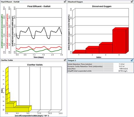
Figure 7‑11 – Example of Different Types of Output Displays
It may take a few iterations to settle on an adequate display. You can stop the simulation at any time, right-click on output graphs to make changes, and then return to the simulation to view the new output. The specific procedures for these steps are examined in detail below.
Analyze/Optimize Graphs
The way an output graph is displayed depends on the simulation mode.
For example, in Analyze Mode, the graphics can be modified to accommodate data in a sensitivity analysis. In this case, the independent variable is not time, rather it is the variable defined by the user as the focus of the analysis. See CHAPTER 9 Analysis Tools for more information.
The display graphs also change in Optimize Mode. See CHAPTER 10 Optimization Tools for more information.
Creating User-Defined Output Displays
Once you have decided on the variables and kinds of graphics you would like to have displayed during a simulation, the next step is to instruct GPS-X to setup the output graphs. This step should be completed before running a simulation, but you can iterate between the simulation and outputs setup to get the displays you like best. The outputs setup procedure is similar to that used for setting up input controls.
There are three major steps in setting up an output graph:
1. Create one or more blank output display tabs by clicking on the “New Tab” button on the Outputs Toolbar.
2. Locate the variables to be displayed on graphs, and drag them to the blank output tab.
3. Adjust the display properties.
Creating a New Output Display Tab
|
|
The “Add Tab” button on the Outputs Toolbar creates a new, blank tab. This blank tab can be filled with graphs containing variables from Output Variables menus from any unit process object in the layout. |
Specify Output Variables to Display
Output variables include state variables and their derivatives, composite variables[7], inputs, special calculated variables, user-defined variables, and model constants.
Any of these variables, including system-related variables, can be displayed.
If the variable you need is not available, but can be calculated from existing variables, you can define it and make it available for plotting. For more information on defining your own variables, refer to CHAPTER 11 Customizing GPS-X.
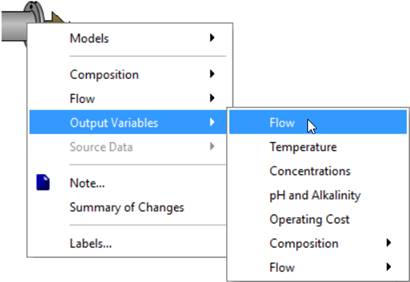
Figure 7‑12 – Output Variables in Process Menu
To select a variable for display:
1. In Simulation Mode, bring up the Process Data menu by right-clicking on an object icon or one of its connection points. Different variables are available at the different spots. Note that the mouse cursor will change to an arrow when you are over top of a connection point.
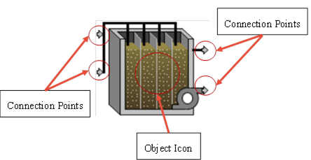
Figure 7‑13 – Different Spots to Access Different Variables
2. Select the Output Variables menu as shown in Figure 7‑12.
3. Select the variable or variable group menu item of interest. A dialog window will be displayed with a list of the available options.
If the output variable is an array, as shown in Figure 7‑15, click on the array button ((…)) to access a second dialog window for selecting the individual elements of the array.
4. Find the display variable and drag it either to:
i. an available blank area of the output tab (Figure 7‑14) to create a new display. It produces an X-Y graph by default, but this can be changed later (see Output Properties section).
ii. or drop it on an existing display to add it to that one.
5. Close the dialog by clicking the ‘Accept’ button.
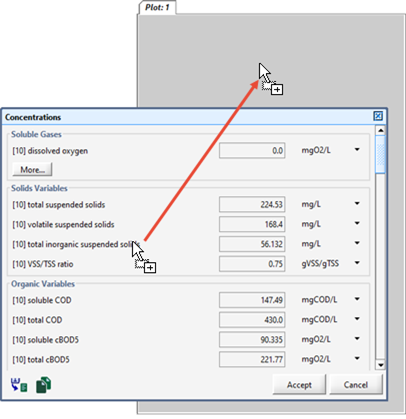
Figure 7‑14 – Dragging Variable to Output Display
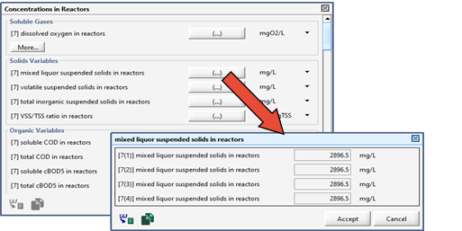
Figure 7‑15 – Accessing Variable Array Dialog
|
Quick Tip: You can quickly create new output graphs by dragging a variable (from a menu or another input control window) to the area to the right of the output tabs. By doing so, a new tab will be created with the output variable assigned to it. This eliminates the need for clicking the “New Tab” button first. |
Selecting Variables for Bar Charts
Elements of an array variable can be displayed most conveniently in a bar chart. To select an array variable for display, use the same procedure as above, but select drag the entire array (ie. the label beside the (…) button) to the output area instead of dragging the individual array elements.
Scalar variables can also be displayed in bar charts. In this case, the bar chart consists of a single bar; however, this is useful for displaying changes in sludge blanket heights, variable tank volumes, etc.
Exporting Data from User-Defined Output Displays
|
|
The entire Output Display can be exported to an Excel spreadsheet by clicking on the “Export Data to an Excel File” menu item found in the Export button drop down list on the Outputs Toolbar. This will open a file browser where you can choose the name and location of the file. Additionally, the entire Table Display can be exported to a Word document by clicking on the “Export Tab to Word” menu item found in the Export button drop down list on the Outputs Toolbar. This will open a file browser where you can choose the name and location of the file. |
|
|
Alternatively, you can copy the data (text only) to the system clipboard by clicking the “Copy Data to Clipboard” menu item found in the Export button drop down list on the Outputs Toolbar. The data can then be pasted into a report or spreadsheet. |
Output Variables vs Input Parameters
The dialog windows that contain the output variables have a similar look to the data entry windows used to specify input values for a simulation. The output variable window differs in that simulation values are displayed, rather than showing an editable field for data entry. Keep this distinction in mind as you access the different window types to avoid confusing output variables with input parameters.
Display Variable Locations
Note the following conventions when selecting display variables:
· The pumped flow stream, effluent flow stream, and last reactor in a plug-flow tank have the same composite, state, and stoichiometric display variable values.
· Not all connection points have the same list of display variables, and the display menu inside the object itself is different from that of the connection points.
The display menus can be grouped into three broad categories:
1. Inside the object;
2. At the effluent or overflow connection point; and,
3. At all other connection points
These display menus are explained further in the next three sections.
Internal Display Menus
There are two types of internal display variable menus depending on the physical configuration of the object, as follows:
1. Completely mixed or zero-volume objects; and,
2. Objects with internal structure.
In the first type, there is no spatial variation in the objects.
The mathematical models are described by algebraic relations (for zero-volume objects) or ordinary differential equations (for completely mixed objects). In either case, no arrays are defined. The internal output variable menu is a copy of the menu at the effluent connection point.
Objects of the second type include plug-flow tanks, layered settlers, sequencing batch reactors, and others. Concentrations may have a gradient in these objects. In mathematical terms, partial differential equations are used and arrays are defined. In these objects, the internal output variable menu is used to access the one-dimensional arrays.
Effluent Display Menus
There are two types of effluent, or overflow, output variable menus depending on the physical configuration of the object, as follows:
1. Fixed-model objects (splitters, combiners, etc.); and,
2. All other objects
The display menus for effluent connection point of objects of the first type have the basic set of display variables, namely Model Information, Flow, Composite Variables, State Variables and Model Stoichiometry.
The overflow location is a special connection point for the majority of the objects. It has three sets of output variables:
1. The basic display variables as for fixed-model objects;
2. Those internal model variables that are scalars, i.e., volume, sludge blanket, etc.; and,
3. Model parameters (just as in the Parameters menu, but only for display)
Other Display Menus
Display menus at these connection points have the basic set of display variables, namely Model Information, Flow, Composite Variables, State Variables, and Model Stoichiometry.
Output Properties
|
|
Once you have selected variables for display and placed them on one or more output displays, you can customize the properties and appearance of each graph. |
|
|
This can be done by either clicking on the “Output Properties…” button on the Outputs Toolbar or right-clicking on an output graph to access the pop up menu and select the option from there. |
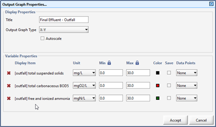
Figure 7‑16 – Output Graph Properties Dialog
As shown in Figure 7‑16, this dialog window has 2 sections.
Display Properties
This section contains settings for the whole graph, such as title, graph type, and the Autoscale option.
For a brief description of the different display types, see the User-Defined Displays overview section.
Autoscaling allows the program to determine the maximum value of the y-axis for you depending on the values of the variables during the simulation. This feature applies collectively to all the y-axes in the graph, and they are all given the same maximum value. The maximum value adjusts appropriately during the simulation run.
Variable Properties
|
|
The Variable Properties section contains individual settings for each of the variables in this display. |
||
|
|
Note that some of the settings may be visible or not depending on the selections in the Display Properties section. |
||
|
|
To remove the variable from the graph, click the small ‘x’ beside the variable you wish to remove. |
||
|
|
If autoscale is not selected in the Display Properties section above, then you can explicitly state the minimum and maximum value that you would like for the y-axis. Beside the min/max label is a lock icon. If the column is ‘locked’ then that means that if you change one value, it will change it for the whole column. ‘Unlocking’ the column allows you to specify a different min/max for each variable. |
||
|
|
The Color column allows you to specify the color of the lines or bars. Clicking on the small, colored box opens a color selector window that allows you to choose a different color. |
||
|
|
The Save column allows you to automatically write data to a file located in the layout directory while the simulation is running for processing outside of GPS-X, such as preparing statistical summaries, presentation graphics or text documents. See the Saving Data to Text File section for more details. |
||
|
|
The Data Points option allows you to display values from a file on the graph as points (as opposed to the simulation data which is displayed as lines). Selecting “File” will display a “Data File” button that can be used to create or view the data. The structure of the data file is the same as the files for File Input Controllers. See the Manually Preparing Data Files section for more information. |
|
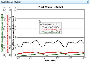
Quick Tip: The numerical value results from any graph can be instantaneously displayed by clicking on the graph itself.
Figure 7‑17 – Graph Showing Instantaneous Values |
||
State Point Analysis Graphs
State point analysis is incorporated in the secondary settlers to analyze the maximum solid loading rates for design purposes. State point analysis may be conducted by using the simulated MLSS concentration or a user-defined design MLSS concentration.
To create a state point analysis graph, right click on the circular or rectangular clarifier objects, and select the Output Variables > State Point Analysis option, as shown below.
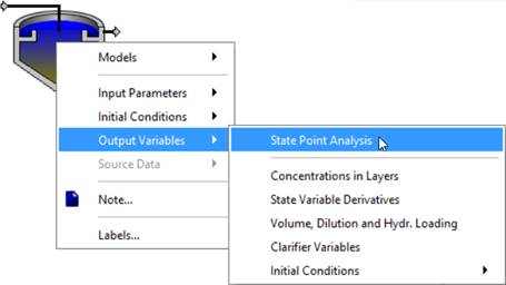
Figure 7‑18 – Creating a State Point Analysis Graph
The state point analysis graph is dynamically updated for any fluctuation in the flow rates to the clarifier. A typical output of the state-point analysis is shown in Figure 7‑19.
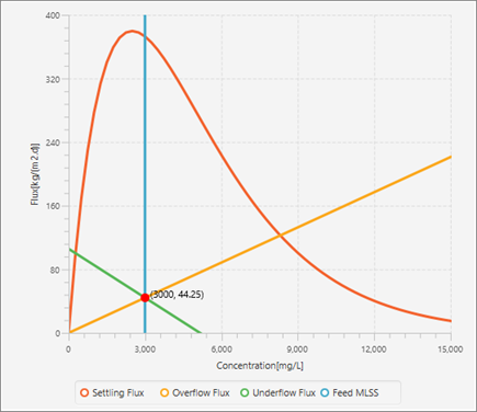
Figure 7‑19 – Example of State Point Analysis Graph
As long as the operation point (red dot) is within the red curve, and the green line is not crossing the red curve, the operational condition of the clarifier is considered to be safe.
Sankey Diagram
After a simulation has been run, you can choose to view a Sankey diagram with the choice of five common variables (Flow, TSS, COD, TN, and TP).
Sankey diagrams are flow diagrams that display variable quantities in terms of arrow width. This allows users to look at the plant's performance visually and compare variable quantities.
Viewing a Sankey Diagram
|
|
To view a Sankey diagram, run the simulation and click on the Sankey Diagram menu item found in the Additional Output Displays button drop down list on the Outputs Toolbar. |
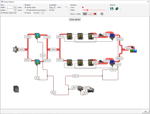
Figure 7‑20 - Sankey Diagram Displaying Flow
Options for the Sankey Diagram
You can customize the look of the Sankey diagram in various ways and export the image to various formats. The options are grouped into five categories.
Size
In the size category, you can manipulate the size of the output diagram by defining the number of pixels you would like diagram width and height to be. By selecting ‘Maintain Aspect Ratio’, GPS-X will automatically scale the unchanged dimension to maintain a constant ratio between the diagram’s width and height.
Display
In the display category, you can choose to hide/show the Sankey lines themselves and/or the numerical values that are displayed on the diagram.
If you are displaying the Sankey lines, you are also given the option to hide/show the mixed liquor streams. You may choose to hide these streams because the values of these streams are typically much larger than the other values and therefore overwhelm the visual difference in the other streams.
NOTE: You can also hide/show individual streams by moving the mouse cursor over the stream (the cursor will change to a hand) and right-click. If the stream is currently showing, you will be given the option to hide it and vice versa. Right-clicking on a blank area of the drawing board will give you to option to “Show All” currently hidden streams.
Variable
In the variable category, you can choose which variable to display and the unit that the value will be displayed in.
You can also choose to hide/show the title on the diagram where the variable name and unit are displayed.
Sankey
This category gives you various options on the appearance of the Sankey lines.
You can change the color by clicking on the little square that shows the current color.
You can vary the maximum width of the Sankey lines by adjusting the slider.
There are three effects that you can choose from for the Sankey lines.
|
|
1. No effect. This will just display the lines in the normal fashion. |
|||
|
|
2. Fade. A width limit can be set such that any value greater than that width will cause the line to fade from a solid color to a more transparent value. |
|||
|
|
3. Darken. A width limit can be set such that any value greater than that width will not increase the width of the line but will instead darken the color of the line proportional to the value. |
|||
|
|
|
NOTE: The width limit for the fade/darken effect is set by clicking the settings button beside the effect option. This will pop up a dialog with a slider where you can adjust the limit and see the immediate effect on the diagram. |
|
|
Export
This category gives you several options for exporting the image.
|
|
1. Save Image to File. Opens a file browser where you can choose the name and location of the image file to save the diagram to. |
|
|
2. Copy to Clipboard. Copies the image to the system clipboard so that you can paste it into a report or spreadsheet. |
Mass Balance Diagram
After a simulation has been run, you can choose to view a Mass Balance diagram with the choice of five common variables (Flow, TSS, COD, TN, and TP).
Mass Balance diagrams are flow diagrams that display variable quantities in a tabular form. This allows users to look at the plant's performance numerically and compare variable quantities.
Viewing a Mass Balance Diagram
|
|
To view a Mass Balance diagram, run the simulation and click on the Mass Balance Diagram menu item found in the Additional Output Displays button drop down list on the Outputs Toolbar. This will start the Mass Balance Diagram wizard (Figure 7‑21).
Figure 7‑21 - Mass Balance Wizard Setup Menu (1) The first option to select under Table Contents is what columns you would like to be displayed in each individual table (variable label, concentration, and mass flow rate). You can then specify which variables you would like to be included in the tables (Flow, TSS, COD, TN, and TP) in the rows section. (2) You then select the streams that interest you. When you are satisfied click Finish to create a Mass Balance Diagram. (3) You will be asked if you would like to auto arrange the table locations, which will organizes the tables around the perimeter of the diagram close to the stream that they represent. |
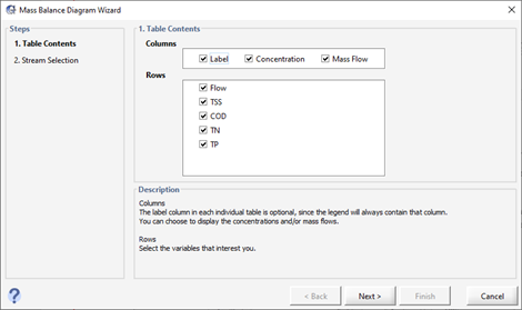
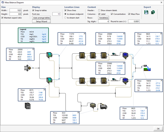
Figure 7‑22 – Mass Balance Diagram
Options for the Mass Balance Diagram
Once the Mass Balance diagram has been generated, you can drag the tales anywhere you would like within the diagram.
You can further customize the look of the Mass Balance diagram in various ways and export the image to various formats. The options are grouped into five categories.
Size
In the size category, you can manipulate the size of the output diagram by defining the number of pixels you would like diagram’s width and height to be. By selecting ‘Maintain Aspect Ratio’, GPS-X will automatically scale the unchanged dimension to maintain a constant ratio between the diagram’s width and height.
Display
In the Display category, you can choose to snap to tables which will attempt to align the tables with other tables or object in the diagram when you move them.
You can also choose to reopen the Setup Wizard in this category which will allow you to add or remove tables from the Mass Balance Diagram.
NOTE: You can also hide individual tables by moving the mouse cursor over the table and right-click. You will be given the option to hide the table.
Location Lines
In the Location Lines category, you can choose if you would like there to be lines connecting the tables to the stream they are representing.
You can also choose where you would like the location lines to connect (midpoint or start of the stream) if location lines are shown.
Content
This category gives you various options for the content in the tables.
You can add the stream name as a header in each table by selecting the ‘Show stream labels’ option.
You can modify which column and row values selected in the setup wizard are shown in the tables.
You can also adjust the adjust the number the number of significant digits you would like present in the tables.
Export
This category gives you several options for exporting the image.
|
|
3. Save Image to File. Opens a file browser where you can choose the name and location of the image file to save the diagram to. |
|
|
4. Copy to Clipboard. Copies the image to the system clipboard so that you can paste it into a report or spreadsheet. |
Energy Usage and Operating Cost Summary
After a simulation has been run, you can choose to view a plant schematic output summary of either the Energy Usage or Operating Costs. These two summaries are discussed together here since their appearance and settings are similar and the only difference is the type of data that is displayed.
Energy Usage Summary 
The model tracks power consumption for aeration, pumping, mixing, heating, and other.
To view an energy usage summary, run the simulation and click on the “Energy Usage Summary” menu item found in the Additional Output Displays button drop down list on the Outputs Toolbar.
Operating Cost Summary 
The model tracks operating costs for aeration, pumping, chemical dosage, sludge disposal, and miscellaneous.
To view an operating cost summary, run the simulation and click on the “Operating Cost Summary” menu item found in the Additional Output Displays button drop down list on the Outputs Toolbar.
Summary Views
The dialog window that is shown when choosing one of the options above, has two different views of the data.
Layout View
In layout view, an image of the layout is shown with ‘hot spots’ around the unit processes that represent the value of the variable that is being displayed. The intensity of the color of the ‘hot spot’ increases as the value gets larger.
An example is shown in Figure 7‑23 where the total power of each unit process is being displayed.
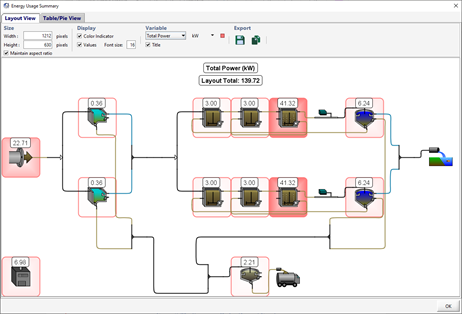
Figure 7‑23 – Summary Dialog (Layout View)
Table/Pie View
In Table/Pie view, the window is divided in two with a table of the different values on the left and a pie chart representation of either the select row or column of data.
An example is shown in Figure 7‑24 where the row with the total power of each unit process is selected.
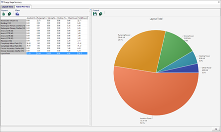
Figure 7‑24 – Summary Dialog (Table/Pie View)
Options for the Layout View
You can customize the look of the plant schematic diagram in various ways and export the image to various formats. The options are grouped into four categories.
Size
In the size category, you can manipulate the size of the output diagram by defining the number of pixels you would like diagram width height to be. By selecting Maintain Aspect Ratio, GPS-X will automatically scale the unchanged dimension to maintain a constant ratio between the diagram width and height.
Display
In the display category, you can choose to hide/show the color indicator (ie. ‘hot spot’) and/or the numerical values that are displayed on the diagram.
Variable
In the variable category, you can choose which variable to display and the unit that the value will be displayed in.
You can also choose to hide/show the title on the diagram where the variable name and unit are displayed.
An option to change the color of the ‘hot spot’ also exists. Clicking on the colored square box beside the variable option will display a color selection dialog.
Export
This category gives you several options for exporting the image.
|
|
1. Save Image to File. Opens a file browser where you can choose the name and location of the image file to save the diagram to. |
|
|
2. Copy to Clipboard. Copies the image to the system clipboard so that you can paste it into a report or spreadsheet. |
Options for the Table/Pie View
Saving Data to Text File
In addition to the Microsoft Excel reports that can be generated for any graph, the simulation results can be saved directly to a plain text file (tab delimited) while a simulation is running.
In the Output Properties dialog window (Figure 7‑16), there is an option to ‘Save’ the variable. If this check box is selected, the data from the simulation will automatically be saved to a file.
All variables that are to be saved will be written to the same file that is located in the same directory as the layout file. The name of the file will have the following format:
layoutname_scenarioname_yyyy_mm_dd.out
Where layoutname is the name of the current layout,scenarioname is the name of the current scenario, and yyyy_mm_dd is the date specified in the Site Properties window under the “Simulation Setup” tab.
Contents
The columns in the file are delimited by tabs.
The first line contains a list of the selected variables, starting with the identifier ‘t’ to indicate the time column.
The second line lists the units of each variable.
If a steady-state evaluation was performed before the run begins, the third line begins with the identifier ‘std’ followed by the results of the steady-state evaluation for each variable.
The remaining rows contain the time stamp and value(s) for each variable.
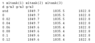
Figure 7‑25 – Example of Plain Text Output File
The .out file remains open until you return to Modelling mode or close the layout.
If Start is selected more than once, any existing file will be overwritten; therefore, the .out file will always contain the results of a single simulation run from the starting time to the stopping time at the interval indicated by the value of the Communication interval.
If desired, you can rename the output data file or move it to a different directory so that subsequent simulations do not overwrite the file.
Using Output Data as Input Data
As GPS-X output data files have the same format as input data files, you can use the input/output capabilities to emulate a record/run macro.
To record a simulation session:
1. Set-up the variables you want to record for file output. In this case, these would be variables that you set up as interactive controls (eg. sliders).
2. Run a simulation, changing the values of the controllers as you like.
3. Rename the output data file to conform to the input data file convention. To do this, simply change the extension of the file from ‘out’ to ‘dat’.
4. For each variable specified in Step 1, change the input controller from the interactive control to a File Input control and run the simulation.
When you run the simulation in step 4, the variable values will be read from the input data file, essentially reproducing the simulation you performed in step 2.
This technique is useful for generating artificial scenarios.
For example, if you want to generate data which approximate a storm event, you can use this method to save data as you manually change the influent flow. Later you can use this data for testing the effects of the storm flow.
Generating a Report
Reports can be exported to a Microsoft Excel spreadsheet file or a Microsoft Word document. These reports can contain images, data, parameter values, model results, and any other combination of text and images.
The report can be generated either before or after simulation.
Reports generated in Modelling Mode will contain only the information about the model and parameter defaults.
Reports generated in Simulation Mode can also contain information about the current state of the model, and time series data from the most recent simulation.
There are three types of reports:
1. Standard Word Report
2. Standard Spreadsheet Report
3. Custom Spreadsheet Report
|
|
You can access the report dialog by either selecting Report from the File Menu or clicking on the Report button on the Main Toolbar. |
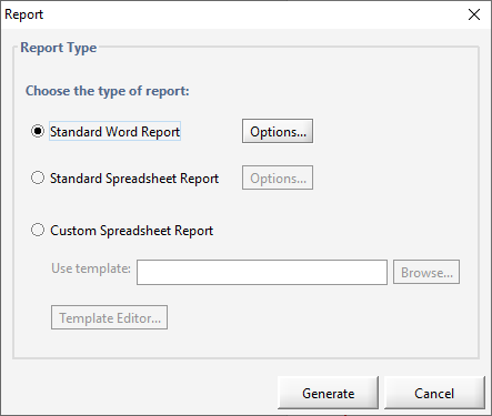
Figure 7‑26 – Report Dialog
Standard Word Report
Standard Word reports use a fixed format and style to display all model input, output, and simulation results.
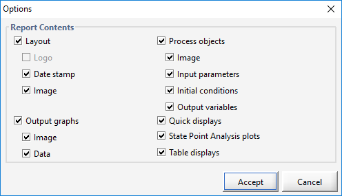
By default, all information will be included in the report. If you wish to exclude certain types of information, select the “Options…” button.
The Options Dialog (Figure 7‑27) allows users to specify which types of information are to be included in the standard Word report. The information is organized under multiple headings within the report.
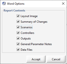
Figure 7‑27 – Options Dialog (Standard Word Report)
|
Quick Tip: In cases where a user has entered information into the “Notes” field for a parameter, that information is inserted in the General/Parameter Notes section of the report, where each object with a Note will be given a table. |