Tutorial 4
Problem Statement
For this tutorial, consider that your supervisor needs you run the plant model on a monthly basis and present them with various reports and information regarding the plant performance, flow through the plant, energy usage, and operating cost.
Objectives
GPS-X makes it simple to create customized tables, and reports, and export the data contained within them to a format that can be easily analyzed and understood.
Creating a New Output Table Tab
1. Open the layout built in Tutorial 3 and save it as `tutorial-4’ using File > Save As...
2. Switch into Simulation Mode if not already there.
In addition to the viewing model results and summaries on the Quick Display and various Graph outputs discussed in Tutorial 2 and Tutorial 3, you can also create custom-designed tables. These tables can be populated with a wide range of model outputs and present the data as a summary of stream or process variables across the layout.
|
|
3. Create a Table Tab. Press the New Table Tab button on the Outputs toolbar. This will open the Table Properties setup wizard. |
|
|
4. Populate the table. By default, all options are selected. We are only interested in a few streams and a few variables, so begin by pressing the Select None buttons at the top of each choice panel. This will deselect all options. |
Then make the following selections on the Stream Choice panel:
· Influent (wwinf) > wwinf
· Aeration Tank (mlss) > mlss
· Final Clarifier 1 (fe1) > fe1
· Final Clarifier 2 (fe2) > fe2
· FE Combiner (fe) > fe
On the Variable Choice panel, select the following:
· Solids > TSS & VSS
· Organic Variables > COD
· Nitrogen Variables > Ammonia Nitrogen & Nitrate & Nitrite
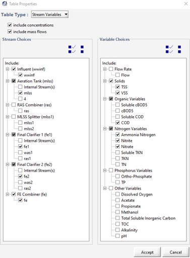
Figure 4‑1 – Table Display Setup Wizard
5. Press Accept to create the table.
6. Run a Steady State simulation of the “Default Scenario” located in the Simulation toolbar under Scenario > Select Scenario and observe the new table tab. From the table we can observe the reduction in the TSS and COD concentrations across both secondary clarifiers (mlss and fe1/fe2 streams); and the nitrification occurring across the aeration tank (wwinf and mlss streams).
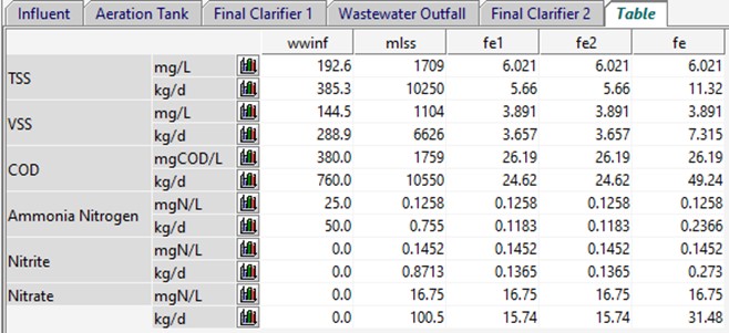
Figure 4‑2 - New Table Tab Output
|
|
7. Export the table. Save a copy of the data in this table by selecting the table tab (if it is not already shown) and press the Export button on the Outputs toolbar. This will open a drop-down menu with the options to export as a Microsoft Word or Microsoft Excel file. Selecting either option will open a file browser where you can select an appropriate location and name for the file. |
|
|
8. View the data as a Bar Chart. If you would like to visualize the data in a particular row, click the bar chart icon next to the unit. This will create a new tab with the appropriate bar chart. |
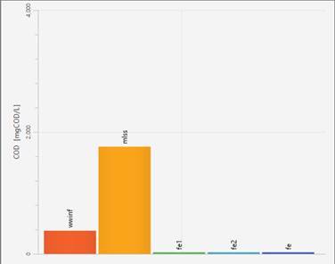
Figure 4‑3 – Bar Charts from Table Display for COD
9. Save the layout.
Additional Output Displays
|
|
10. After running a simulation, options in GPS-X, it will unlock to analyze the results of the simulation. On the Outputs toolbar, the Additional Output Displays option will become enabled. |
11. Selecting the Additional Output Displays option will open a drop-down menu with various useful tools for visualizing the outputs of the simulation. We will now explore each option available in this menu.
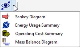
Figure 4‑4 - Additional Output Displays Menu
Creating a Sankey Diagram
GPS-X can create a Sankey diagram of five variables (Flow, TSS, COD, TN, and TP). Sankey diagrams are flow diagrams that display variable quantities in terms of arrow width. This allows users to look at the plant's performance visually and display the results effectively.
|
|
12. Open the Sankey Diagram window. Once a simulation run has been completed, select the Sankey Diagram option from the Additional Output Diagrams drop down menu. This will open the Sankey Diagram window. |
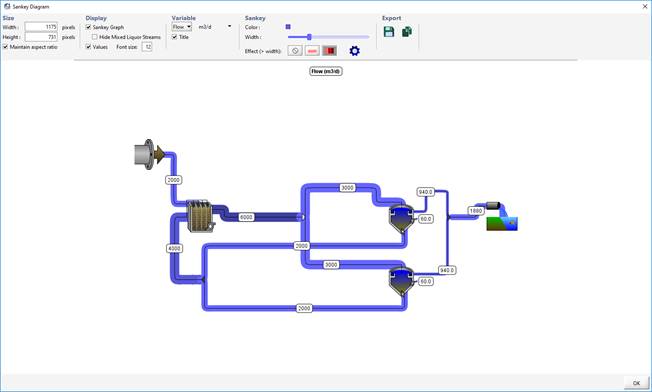
Figure 4‑5 - Sankey Diagram Example
Figure 4‑5 shows a Sankey Diagram of the system flow rates. The diagram displays the Sankey graph and the values for each stream.
Notice that a stream with a higher flow rate displays a wider arrow. In this example, the flows out of the clarifiers illustrate this. The effluent stream (940 m3/d) has a much bigger arrow than the tiny arrow exiting the pumped flow (60 m3/d).
You can change settings and output variables using the Display, Variable, and Sankey features on top of the Sankey diagram window.
The Sankey diagram can be exported using the Export features.
Creating a Mass Balance Diagram
The values represented visually by the thickness and color of the lines in a Sankey Diagram can also be represented numerically in a Mass Balance Diagram.
|
|
13. Open the Mass Balance window. Once a simulation run has been completed, select the Mass Balance Diagram option from the Additional Output Diagrams drop down menu. This will open the Mass Balance Diagram Wizard menu |
This menu will allow you to select what information you would like to be displayed on the diagram. The Columns options can be used to toggle the display of concentration and/or mass flow rates while the Rows options can be used to select the variables of interest.
14. Press Next.
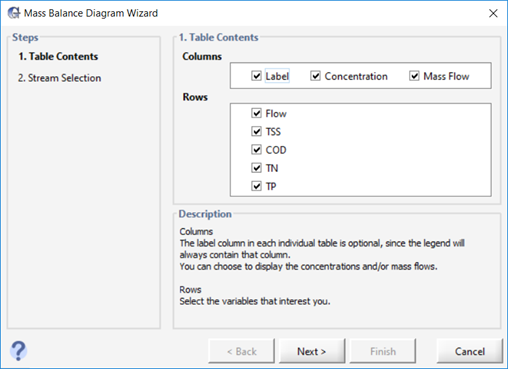
Figure 4‑6 - Mass Balance Setup Wizard Table Contents
|
|
15. Select the Streams. The Mass Balance Wizard will initially select all the streams on the drawing board, but we are only interested in a few of the streams. Press the Select None button to deselect all options. |
Select the following options from the menu:
· Influent (wwinf) > wwinf
· Aeration Tank (mlss) > mlss
· Final Clarifier 1 (fe1) > fe1
· Final Clarifier 2 (fe2) > fe2
· FE Combiner (fe) > fe
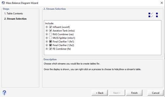
Figure 4‑7 - Mass Balance Setup Wizard Stream Selection
16. Press Finish to confirm the streams you would like to be shown in the diagram.
17. Auto Arrange. After selecting finish, you will be prompted to auto arrange the table locations. By selecting this option, GPS-X will align all the tables along the top and bottom of the diagram close to the stream it is creating a table for. Choosing not to auto arrange the tables will use a previous table layout if available. In this case, it will produce the same layout as auto arrange.
After accepting auto arrange, the Mass Balance Diagram will open. You can click and drag the tables anywhere you would like in the diagram window. Figure 4‑8 shows a Mass Balance Diagram of the system after the user has manually arranged the tables. The diagram displays the mass and concentration flow rates of the variables in each stream of interest.
The Mass Balance Diagram can be exported using the Export features.
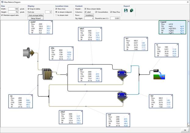
Figure 4‑8 - Mass Balance Diagram Example
Viewing an Energy Usage Summary
After a simulation has been run, you can choose to view a plant schematic output summary of either the Energy Usage or Operating Costs. First let’s explore the Energy Usage Summary.
|
|
18. Open the Energy Usage Summary window. Once a simulation run has been completed, select the Energy Usage Summary option from the Additional Output Diagrams drop down menu. This will display the Energy Usage summary window. |
In the window, an image of the layout is shown with ‘hot spots’ around the unit processes that represent the value of the variable that is being displayed. The intensity of the color of the ‘hot spot’ increases as the value gets larger.
By selecting a different type of power usage from the “Variable” pull-down menu, you can view a summary of the different types of power used in the plant (aeration, pumping, mixing, etc.).
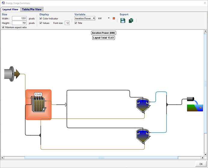
Figure 4‑9 - Energy Usage Summary Window
19. Click on the Aeration Tank. This will take you to the “Table/Pie View” and select the row that corresponds to the aeration tank. Changing the selected row/column will change the pie chart to display the appropriate data.
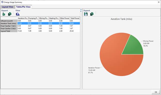
Figure 4‑10 - Table/Pie View of Aeration Tank
20. Press OK to close the window.
Viewing an Operating cost Summary
We will now explore the Operating Cost Summary.
|
|
21. Open the Operating Cost Summary window. Once a simulation run has been completed, select the Operating Cost Summary option from the Additional Output Diagrams drop down menu. Selecting it will display the Operating Cost summary window. |
You will notice that this window is arranged in a similar manner to that of the Energy Cost Summary window. An image of the layout is shown with ‘hot spots’ around the unit processes that represent the value of the variable that is being displayed. The intensity of the color of the ‘hot spot’ increases as the value gets larger.
By selecting a different type of costing from the “Variable” pull-down menu, you can view a summary of the different types of operating cost that exist in a plant (aeration, chemical dosing, sludge disposal).
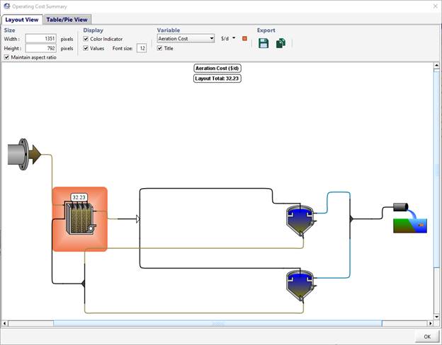
Figure 4‑11 - Energy Cost Summary Window
22. Click on the Aeration Tank. This will take you to the “Table/Pie View” and select the row that corresponds to the aeration tank. Changing the selected row/column will change the pie chart to display the appropriate data.
Generating a Report
You may wish to create a report with a list of all the parameter values, as well as the model results for a particular simulation. The reports are generated in Microsoft Excel or Microsoft Word format.
|
|
23. Click on the Report button in the main toolbar (NOT the button with a similar icon on the Output toolbar. That one will just export the selected output display). |
This will open a window where you can create a Standard Word Report or create a Standard or Custom Spreadsheet Report.
24. Select Standard Spreadsheet Report. The Options button beside it allows you to include/exclude certain data from the report.
25. Press the Generate button. A file browser will be displayed where you can choose an appropriate directory and file name.
26. View the Report. After it’s created, you will be asked if you want to open the file. Click Yes, and the report will be opened in Excel. Browse through the various worksheets to see the model layout, details of each object, and output graph data
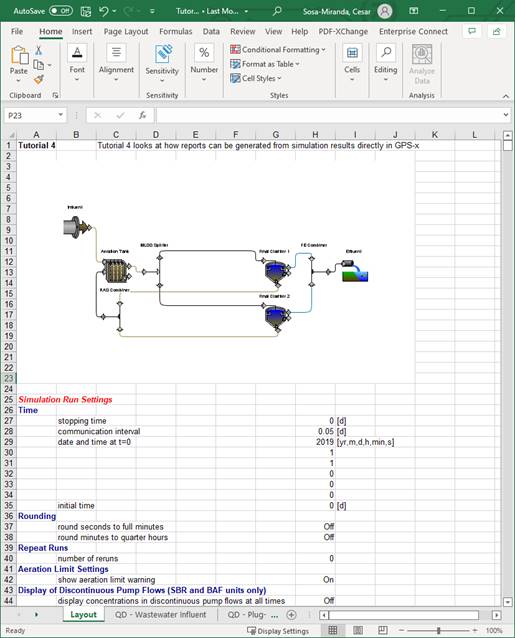
Figure 4‑12 - Sample Spreadsheet report from GPS-X