Tutorial 2
While steady state simulations provide the foundation of a model, the value comes from the ability to run dynamic simulations.
Objectives
This tutorial covers the following topics:
1. Setting up graphics and interactive controllers
2. Running interactive simulations
When you have finished this tutorial, you will be able to run full-scale dynamic treatment process models. You will learn the procedures for creating time series graphics and interactive controls. These essentials provide a foundation on which other advanced features are built; therefore, it is important to understand the material in this tutorial first before going on to more complicated tasks.
Creating Input Controls
GPS-X is an interactive simulation program, or simulator, which can run both pre-defined simulations and interactive sessions. We will now set up an interactive session that allows us to investigate the effects of changes in the influent flow rate on the plant effluent quality.
Our first task is to create a new Input Control. An input control is an interactive tool, which can be used to change the value of model variables during the course of a simulation run. You can create as many input controls as desired.
Here, we will create a single control for the plant influent flow so that this variable can be changed during a simulation.
1. Open the layout built in Tutorial 1 and save it as `tutorial-2’ using File > Save As...
2. Switch to Simulation Mode.
3. Access the parameter by right-clicking on the influent object and select the Flow Data item from the Flow sub-menu as shown below.
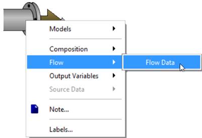
Figure 2‑1 - Accessing Flow Parameter
4. From the Flow Data entry form, drag the influent flow variable to the blank input control area above the layout, as shown below.
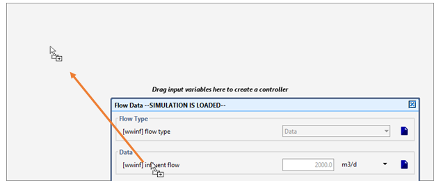
Figure 2‑2 – Dragging Variable to Control Tab
Note that a new tab (labeled “Input: 1”) has been created for the input control. Multiple controls can be placed on a single tab, or on as many tabs as required.
|
|
5. Edit the input control properties by clicking on the Input Control Properties… button on the Controls toolbar. An entry form window will be displayed. |
You can use this form to set minimum (Min), maximum (Max), and control increment (Delta) values (if applicable) for a particular variable.
Select 0 for Min and 12000 for Max. It is not necessary to enter a value in the Delta column, as we will use a slider-type control, which does not require a value for this attribute.
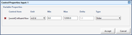
Figure 2‑3 – Control Properties Window
Note that you have the choice of a variety of controller types (under the Type heading). Make sure that Slideris selected for the influent flow item.
Remember to save your changes by pressing the Accept button.
6. Rename the control tab by double-clicking on the tab name “Input: 1”. Type “Flow Control” and press Enter.
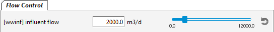
Figure 2‑4 – Finalized Input Control
An input control for the plant influent flow has now been created.
The tab shown in Figure 2‑4 contains a slider that allows you to change the influent flow from 0 to 12000 m3/d.
You can test the slider control by dragging the small slider knob. Note that the influent flow value will change to the value displayed on the control.
|
|
Before proceeding, use the Reset button at the far right of the slider to move the slider back to the default position of 2000 m 3/d (alternatively, you may enter the value into the control box with the keyboard). |
Creating Output Graphs
In addition to the summaries available on the Quick Display panels, you can create new custom-designed output graphs for numerous variables located in the Output Variables menu of each object that can be seen when right-clicking on an object.
These variables cover a wider range of model outputs and can be used to supplement the standard output in the Quick Displays.
|
|
7. Create a new, blank output tab by clicking on the New Graph Tab button on the Outputs toolbar. A new, blank output tab will be created. |
8. Create a graph of the influent flow by right-clicking on the influent object and select Output Variables > Flow as shown below.
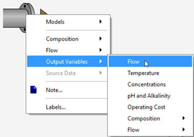
Figure 2‑5 - Accessing Output Variable Windows
9. From the Flow window, drag the influent flow variable to a blank area on the new tab that you created, as shown below. This will create an X-Y Graph with that variable on the y-axis. Select Accept or Cancel to close the Flow window.
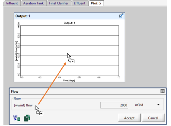
Figure 2‑6 – Dragging Variable to Create a Graph
10. Next, right click on the wastewater outfall unit and select Output Variables > Concentrations from the pop-up menu.
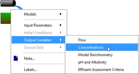
Figure 2‑7 - Accessing the Concentrations Menu from the Wastewater Outfall
Alternatively, if a Wastewater Outfall object were not used, this menu could be accessed by right clicking on the clarifier’s effluent overflow stream. When you place your cursor over the effluent overflow stream, the cursor will change from the default Microsoft cursor to the connecting arrow, that is seen in Figure 2‑8. Right click and select Output Variables > Concentrations from the pop-up menu. Note: Ensure the connection arrow is present because clicking on the center of the object will open a different menu than the connection point [2].
Figure 2‑8 - Connection Point Cursor Change
11. Drag the total suspended solids variable to the same graph as the influent flow. This will add another y-axis to the graph for this variable.
|
NOTE: There is a difference between data entry forms and output variable forms even though both have a similar appearance and may contain the same variable name entries. Data entry forms contain a field on the right-hand side for entering data. In output variable forms this field displays model results and cannot be edited. Variables dragged from a data entry form can be placed on input control tabs whereas variables dragged from an output variable form can be placed on graphs in the output field. |
|
|
12. Resize and arrange the graph by clicking on the Auto Arrange button on the Outputs toolbar. Your simulation environment should appear as shown below. |
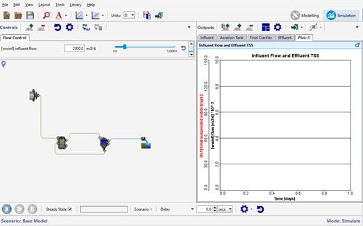
Figure 2‑9 - Simulation Environment with Output Graph
|
|
13. Access the output graph properties window by right-clicking on the output graph and selecting the Output Graph Properties… item from popup menu. Alternatively, you can press the settings button on the Output toolbar. |
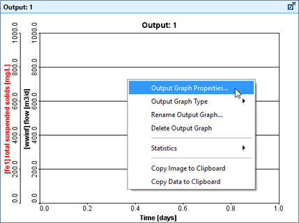
Figure 2‑10 – Accessing Output Graph Properties
The Output Graph Propertieswindow is used to specify plotting attributes including the min and max y-axis values, the color of the variable’s line and the units that the data will be displayed in.
The Autoscale feature can be used to allow the y-axis to automatically set an appropriate max value depending on the data being displayed (it will adjust during the simulation). By selecting this you will not have the option to adjust the values under the Variable Properties section of the Output Graph Properties window.
The Output Graph Type item is also available here. By default, the graph type is X-Y (time series) but this can be changed to several different options. For this tutorial, we will be leaving it as X-Y.
14. Enter a minimum and maximum value for each variable. Use 0 and 10,000 m3/d for flow, and 0 and 150 mg/L for total suspended solids.
|
|
NOTE: You must ‘unlock’ the max fields to be able to edit them individually otherwise the change in one field will be copied to the others. This is because quite often people will plot variables of similar characteristics on a graph and they’ll want the y-axis to have the same scale. |
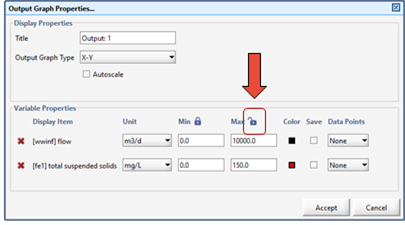
Figure 2‑11 – Output Properties showing Unlocked Max Field
Keeping the max fields unlocked, Accept the changes when you are finished.
15. Rename the output graph. This can be done in the properties window described above, but several of the properties can also be accessed from the popup menu by right-clicking on the graph. Do this and select Rename Output Graph…. Enter an appropriate title for the output graph and click OK.
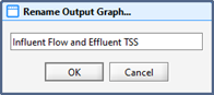
Figure 2‑12 – Rename Output Graph
Running a Dynamic Simulation
You are now ready to run the model. All of the controls that you will need to run a dynamic simulation are located on the Simulation Toolbar at the bottom of the screen.
![]()
Figure 2‑13 – Simulation Toolbar
16. Specify a simulation duration time of 20 days by either entering the value directly into the Stop Time field or by repeatedly clicking on the up arrow adjacent to field to increment the value by 1 day for each click.
|
|
17. Ensure the Steady State checkbox on the Simulation toolbar has been checked. |
|
|
|
|
NOTE: The Steady State checkbox is used to indicate if the steady state solver is used to initialize the simulation. When checked,
When not checked,
Dynamic simulations involve changes in operation over a simulation period. This allows you to see dynamic relationships in process. Typically, a dynamic simulation will begin from a steady state solution. Dynamically operated simulations are in a constant state of change and will allow modelling of variations in influent compositions, plant operation and other events and disturbances. The difference between simulation operated in Steady State and one operated Dynamically can be seen in the following figure.
Steady State Simulation Dynamic Simulation |
||
|
|
18. Start the simulation by clicking on the Start button. |
||
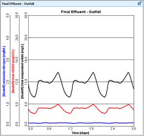
While the simulation is running you can now change the flow with the input control slider bar and assess the effect of changes in influent flow on the effluent suspended solids of the plant.
If the flow is high enough (say 7,000 m3/d) you will see a significant increase in the effluent suspended solids due to clarifier overload.
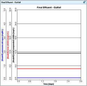
An example run is depicted in Figure 2‑14, where the flow was increased with the input control slider bar during the simulation run. Note that your output graph will look different than the one presented below depending on how you adjust the slider control during the simulation run.
Figure 2‑14 – Example Run with Flow Increase
19. Run the simulation again, but this time, adjust the influent flow by dragging the influent flow slider away from 2,000 m3/d.
If the simulation proceeds too quickly, you can artificially slow down the simulation by inserting a delay. Add a delay by putting 0.5 (or any other number, the magnitude of the number dictates the degree of delay) into the Delay entry field using the Stop Time/Communication/Delay drop-down menu on the Simulation Toolbar.
|
NOTE: If the simulation time exceeds the stop time (Stop) the model will halt. At that time, you have two choices:
· Increase the length of the simulation by increasing the value of Stop and clicking Resume to continue the simulation. |
Analyzing the Plant
We will now take a more detailed look at our plant's performance by investigating the effect of increased flow on the secondary clarifier. We will first set-up an output graph displaying the solids profile inside the final clarifier. We will then simulate steady-state conditions with the design flow of 2,000 m3/d and investigate the change in the solids profile inside the final clarifier by running the model at a higher flow rate (i.e. simulating a storm condition).
To investigate the effect of increased flow on final effluent quality, you will first set up a graph to view the output of the solids profile inside the final clarifier.
20. Access the Concentrations of the clarifier by right-clicking on the object and selecting from the Output Variables > Concentrations.
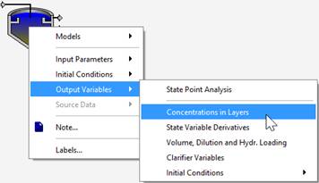
Figure 2‑15 - Accessing Concentrations
21. Drag the total suspended solids in layers (see Figure 2‑16) item to the blank area to the right of the existing output tabs. By dropping it there, a new tab is automatically created, and the desired graph is created on the new tab.
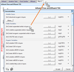
Figure 2‑16 - Dragging Variable to New Table
Since this variable is actually an array of values (denoted by the fact that it has an ellipsis (…) button next to it which can be used to access the individual values) then the graph that is created is by default a Bar Chart with the array elements along the x-axis.
22. Change the graph type. In this case, instead of the default vertical bar chart, we’d like to view the clarifier profile as a horizontal bar chart. This gives you a better intuitive feel of the different layers within the clarifier. The bar representing the bottom of the clarifier (index 10) will be at the bottom of the graph.
If you right-click on the output graph and select the Output Graph Typeitem, you will notice that the Bar Chart type has already been selected. Select the Bar Chart (Horizontal) type for this graph.
23. Change the axis max. Go into the graph properties and change the max value to 5000 mg/L.
24. Rename the graph. Right-click on the graph and select the Rename Output Graph… item from the drop-down menu and enter an appropriate title.
Note that you can also change the name of any tab by double-clicking on the tab name and entering a new one.
25. Resize the graph. Press the Auto Arrange button or drag the edge of the graph window to your desired size.
26. Select the Steady-State option and Start the simulation setting Stop to 10 days. Make sure that the influent flow is set to 2,000 m3/d on the input control. Below is a figure that shows a bar chart profiling the solids distribution inside the final clarifier.
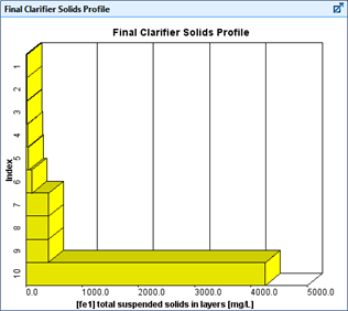
Figure 2‑17 – Clarifier Profile Graph
|
|
27. Increase the influent flowrate to a higher value (i.e. 5,000 m3/d) with the controller. Adjust Stop Timeto 20 days and Resume the simulation. |
The bar chart profiling the solids distribution inside the final clarifier will change to reflect the build-up of solids due to higher flows. You can adjust the max axis value to see the entire graph, if you’d like. The values will become greater than the existing scale.
28. Save the layout. Press the Save button on the main toolbar.